.grecaptcha-badge{
     visibility: collapse !important;
 }
CSS
Force full width container with CSS
margin-left: calc(-100vw / 2 + 1280px / 2);
margin-right: calc(-100vw / 2 + 1280px / 2);
Vertical centering with flexbox
.cover {
     display: flex;
     justify-content: center;
     align-items: center;
     text-align: center;
 }
How to create raster grid above an image with css?
.raster-grid {
     background-image: repeating-radial-gradient(circle at center center, rgba(240, 243, 243, 0.11), rgba(240, 243, 243, 0.11) 1px, transparent 1px, transparent 100%), linear-gradient(0deg, rgba(24, 84, 179, 0.84) 0%, rgba(4, 35, 63, 0.94) 100%), url("https://yourdomain.com/img.jpg") !important;
     background-size: 3px 3px, auto, cover !important;
     background-position: 50% 50%, 50% 50%, 50% 50% !important;
     background-attachment: scroll, scroll, fixed !important;
     background-repeat: repeat, no-repeat, no-repeat !important;
 }
CSS Grid Template Area
/* =====================================================================
Practice CSS Grid Layout
======================================================================== */
/*
Target each grid item.
Give each selector a grid area name.
*/
header {
grid-area: head;
}
main {
grid-area: main;
}
.about {
grid-area: about;
}
.news {
grid-area: news;
}
.links {
grid-area: links;
}
.ads {
grid-area: ads;
}
footer {
grid-area: foot;
}
.grid {
height: 100vh;
display: grid;
/* Set only the top row to 100px */
grid-template-rows: 100px;
/*
Declare 3 flexible column tracks
- The first track should take up two fractions of the available space
- The second and third tracks should take up one fraction of the space
*/
grid-template-columns: 2fr 1fr 1fr;
/* Apply a 10px gutter between rows and columns */
grid-gap: 10px;
/*
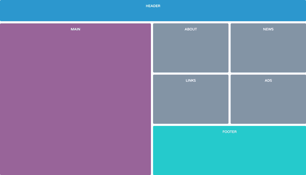
Place items on the grid using their grid area names
- Use the image 'grid-template-areas.png' as a reference
*/
grid-template-areas:
"head head head"
"main about news"
"main links ads"
"main foot foot";
}
CSS Grid with Flexbox
/* =====================================
    Grid & Flexbox Layout
 ======================================== */
 .main-content {
   width: 95%;
   max-width: 1000px;
 display: grid;
   grid-template-columns: repeat(auto-fit, minmax(280px, 1fr));
   grid-gap: 20px;
 }
 .card {
   display: flex;
   flex-direction: column;
 }
 .btn {
   margin-top: auto;
 }
CSS Grid with Media Queries
/* =====================================
    Grid Layout
 ======================================== */
 .container {
   height: 100vh;
   display: grid;
   grid-template-columns: 1fr;
   grid-auto-rows: minmax(150px, auto);
   grid-gap: 10px;
   grid-template-areas:
     "header"
     "nav"
     "main"
     "aside"
     "footer";
 }
 header {
   grid-area: header;
 }
 nav {
   grid-area: nav;
 }
 main {
   grid-area: main;
 }
 aside {
   grid-area: aside;
 }
 footer {
   grid-area: footer;
 }
 @media (min-width: 768px) {
   .container {
     grid-template-columns: 1fr 2fr 1fr;
     grid-template-rows: 100px minmax(150px, auto) 100px;
     grid-template-areas:
       "header header header"
       "nav main aside"
       "footer footer footer";
   }
 }
 @media (min-width: 992px) {
   .container {
     grid-template-areas:
       "header header header"
       "nav main aside"
       "nav footer footer";
   }
 }
Darken and lighten color with SASS
//Variables
 $base: #3acec2;
 $base-dark: darken($base, 25%);
 $base-light: lighten($base, 25%);
 $complement: complement($base);
 $complement-light: lighten($complement, 10%);
CSS Transparent layer filter to cover image
.header-hero {
     background-image: linear-gradient(0deg, rgba(0,0,0,0.5) 50%, rgba(0,0,0,0.85) 100%), url();
 }