/* =====================================================================
Practice CSS Grid Layout
======================================================================== */
/*
Target each grid item.
Give each selector a grid area name.
*/
header {
grid-area: head;
}
main {
grid-area: main;
}
.about {
grid-area: about;
}
.news {
grid-area: news;
}
.links {
grid-area: links;
}
.ads {
grid-area: ads;
}
footer {
grid-area: foot;
}
.grid {
height: 100vh;
display: grid;
/* Set only the top row to 100px */
grid-template-rows: 100px;
/*
Declare 3 flexible column tracks
- The first track should take up two fractions of the available space
- The second and third tracks should take up one fraction of the space
*/
grid-template-columns: 2fr 1fr 1fr;
/* Apply a 10px gutter between rows and columns */
grid-gap: 10px;
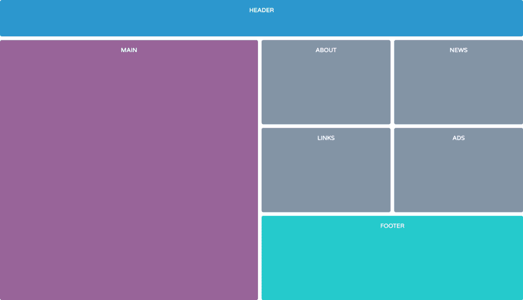
/*
Place items on the grid using their grid area names
- Use the image 'grid-template-areas.png' as a reference
*/
grid-template-areas:
"head head head"
"main about news"
"main links ads"
"main foot foot";
}